It has always been important for designers to understand technical aspects in order to come up with targeted solutions. But for designers of digital products in particular, acquiring expertise through software seems tedious. Nevertheless, everyone who has used an app or other software knows that the user experience is often also determined by the performance, the loading times and a “good implementation”.
This text is suitable for designers and future designers of digital products who feel the need to understand technical aspects of designs.

In this article, I would like to introduce a handful of principles of computer science that I find very helpful when designing software. Everything revolves around technology, but also about user experience.
- The difference of compiled and interpreted code
- Forward and backward compatibility
- The Document-Object-Model (DOM)
- Positioned and floating layout elements
- Synchronous and asynchronous loading
The difference of compiled and interpreted code
Have you ever attended a software project where the scope shifted from a native app to a web-app in the middle of the design phase? That was fun, no?
Technology is clearly affecting user experience. So when changing from a native app to a web app the design has to adapt. In this case a native app stands for a compiled and the web-app for an interpreted program, and there is a huge difference.
A compiled language is a program that — once compiled — has been “translated” into the instructions of the target device. That’s why we call those native apps — it speaks its mother tongue. The software to compile such a language (called compiler) does not have to be installed on the device that runs the app. But most of the time you have to install the compiled app itself on your device. Any app from the Apple Appstore, for example, is a native app.
A interpreted language works different. It gets translated when executed — “on the fly”, so to speak. To do so it needs interpretation software installed on the device. An example being a website that gets read out by a internet browser.
In most cases the compiled programs result in better performance while interpreted programs are easier to implement. It is good to know the difference in order to understand the limitations and possibilities of the software you are about to design.
Forward and backward compatibility
At the beginning of a design project, information is gathered that will guide the process and drive the decisions. Technical constraints are a big part of that. Questions will be asked. Is there anything we need to adapt from the older versions of this software? Should it be supported by older operating systems, browsers or devices? How does a system react to errors produced by the machine itself?
You will have a much better understanding of the answers given once you understand the strategy of compatibility the software is using.
A forward compatible program is designed to run on future systems. Conversely, future systems should be designed to still support the program even if it aged along the way.
A backward compatible program has the ability to work with known input and ignore unknown input. HTML and CSS works like this. A website from the 90s can still be opened in a modern web browser. It might not look crisp and will not support animations or border-radius, but you will — most likely — be able to read the text and see the images.
Good web design is respecting this matter at it’s conception. In the end it is also about error handling. Two highly discussed strategies that solve backwards compatible software in the web are progressive enhancement and graceful degradation. You might want to read in those as well.

The Document-Object-Model (DOM)
A software architecture separates the logical and functional bit from the presentational one (see Model-view-controller). UI and brand designers spend a lot of time on the presentation layer so they would want to know how it is produced, organized and maintained to be able to design appropriately for it.
In web projects a big part of this presentation layer consists of HTML. When a browser opens a webpage, it reads the HTML and creates the — so called — DOM from it. The DOM contains all the data of the webpage. Visual objects such as buttons, texts or images are part of the DOM, but also hidden ones like meta information about the page or an invisible objects that can be used to build a layout grid.
These objects are organized in a tree-like structure following a logic of parents, children and siblings.
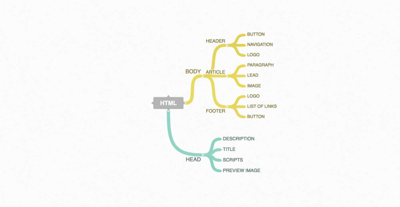
In the example picture the NAVIGATION object would be nested as a child with the HEADER as its parent. The BUTTON would be a sibling.
It is quite important to understand the hierarchical structure of HTML and the DOM. In some ways, this nested structure seems to be the whole idea leading us towards the modern approach of atomic UI design with elements, components and modules.
Positioned and floating layout elements
Different from print layouts, layout for websites and apps get constructed. There is a logic in every digital layout, holding together its visual elements and I don’t mean the grid. When designing for the web, it is very helpful to explore those. The interplay of parameters like display (block, inline, …), float (left or right) and position (fixed, absolute, relative) with other ones such as width, height, max-width, margin or box-sizing offers a variety of construction possibilities.
If one understands how to work with them and make use of their properties, one can truly design flexible, responsive layouts and come up with innovative solutions that look appealing on any screen. Designers can also prototype grids and layout principles that are usually welcomed by developers as a way to brief them on a design.
There is not much to write about at this point. It is hard to understand how the parameters work together without exploring it. So yes, this one is about getting your hands dirty and trying out some CSS.
Synchronous and asynchronous loading
The infinite scroll of facebook’s newsfeed or the drag&drop behavior of Google drive, both are examples of asynchronous loading. It enables functions which boost the UX of web applications.
It is actually all about client-server-communication.
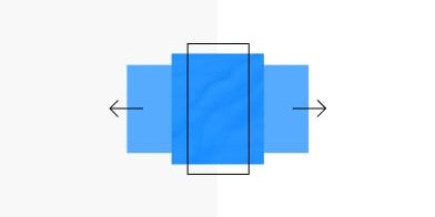
A synchronous page load has a single stream of communication. It loads one entire page bit after bit in one pull. When the stream is finished the communication is cut.
An asynchronous page load can establish multiple communication streams at a time and thus load many parts at once. It can also reload certain parts of a webpage and add it to the already loaded elements — such as facebook’s infinite scroll. A core technology for asynchronous loading is AJAX.