We spoke to Boana founder Johannes Holl at his studio about screens, browser windows and cross-media user flows.
Hi Johannes. We met to talk about a design principle that no industry can afford to ignore anymore. Let's chat about responsive web design – how it came about and what made it so successful.
The first question is pretty much obvious: How would you define responsive web design?
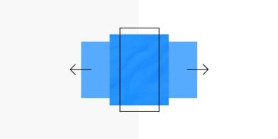
Responsive web design optimizes a website to be displayed on different screen sizes. The knack is that a page can be created for different screen sizes without having to build multiple pages.
Do you have to do responsive web design today or are there alternatives?
Of course, it always depends on the strategy you are pursuing. And the touchpoints you want to reach your customers at. There are certainly businesses that do not have to optimize for all screen sizes. As a rule, however, smaller screens such as smartphones are in great demand because most people use these screen sizes. Mobile phone use has increased tremendously in the past decade. Therefore, it makes sense to optimize for it.
But we have also had clients where we started the other way round. For example, for products that are primarily bought by the IT department. Here, the use on very large desktop monitors of more than 25 inches is very high. That's what you should pay extra attention to.
The alternative to responsive design would then be something called adaptive web design. Instead of a website that automatically adapts to different screens, you create different versions of the site for different screen sizes. But if you then have to maintain the version of this website three times, you also have to maintain the content three times, maintain different code three times and correct errors three times. And the three different pages have to be optimised for different browsers. So the effort is multiplied. There are business cases where it is not necessary to go for full responsive web design, but most of the time it’s a good idea.
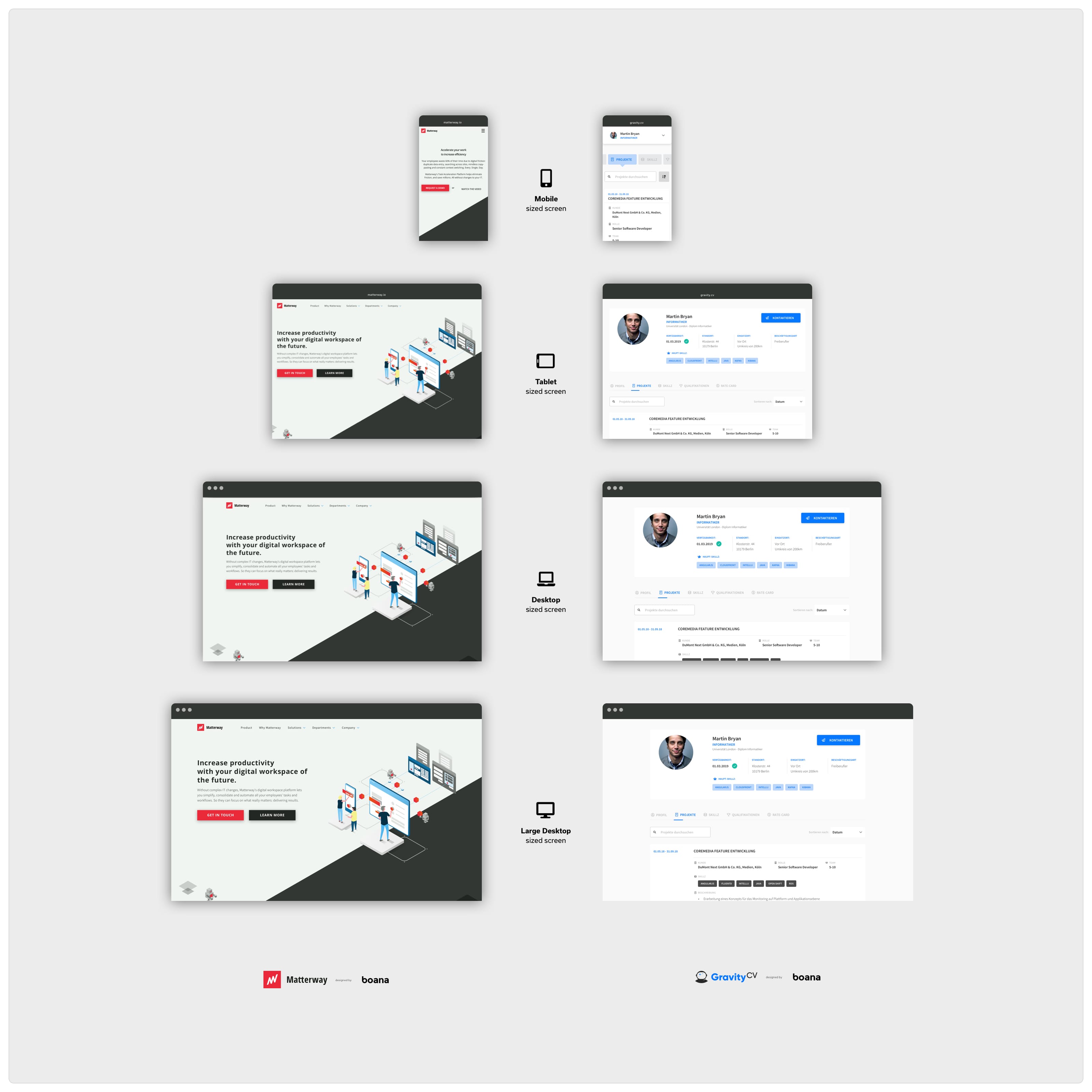 Examples of Responsive Design for a landing page (left) and a digital product (right).
So does that mean you should be clear about the devices on which the site will probably be used before you start?
It's more of a general question, namely how to approach such a project at all. If you do not yet have any data on usage or user group – i.e. starting from scratch – and initially only need an information page that should tell the visitors a first story, then the best way to start is with a test balloon, e.g. with a so-called onepager. If more and more content and subpages are added, it becomes more and more complex. For large websites with a wide variety of page types (all of which have to function responsively), there are different approaches to proceed with the implementation. Maybe we can go into this again later.
Let’s go back to the point in time when responsive web design became established. Was there such a specific point in time at all?
You would probably want to refer to Ethan Marcotte, who posted an article in 2010 entitled “Responsive Web Design”. In it, he described how websites can be adapted to the conditions of browsers. Although that was probably the starting point of this term, there were web designs before that that were responsive in some way.
Google and other big players had already experimented with a design called “Liquid Layout”. For example, tables or other elements on a website were given percentage values so that the page would automatically adapt to the size or width of the browser window, the so-called viewport. So there were forerunners or similar efforts, but Ethan Marcotte gave this style its name and was the first to describe it. Since then, it has become a discipline and has been continuously expanded.
What was the main driver behind this development?
 So before the iPhone, there weren't that many screens of different sizes. Most were laptops – at that time mostly 1024 pixels wide – and of course a few that were a bit bigger.
And then came the iPhone, which had a screen width of 320 pixels at the time. This phone also had a browser and that's why we had to display our web pages on it. And everyone said at the time: Well, then we'll build an extra version for the iPhone. Actually, no problem at all.
But then came the Android devices, then there were several iPhone screen sizes, and later tablets entered the market. And with that, the landscape of screen sizes became incredibly diverse and heterogeneous. In addition, there were also different resolutions, e.g. screens with Retina, later 4k, and therefore you had another dimension – namely the resolution. So of course you could no longer say: OK, then I'll build a separate page for each of these versions. Responsive web design is ultimately the only way to cope with this complexity of devices and screen sizes. This development has already widely changed how we perceive the web. And of course how we have to build for the web.
Responsive web design is ultimately the only way to cope with this complexity of devices and screen sizes.
How do you make sure in your working process that the user experience is really good on the different screens?
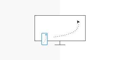
You can explain this quite well by looking at the work of designers from other disciplines. Let's say a product designer creates a bottle for water. Here, one would create different versions of a model for the product and then see how they work. For example, do they lie well in the hand when I bring them to my mouth? How does it feel, in terms of weight shift and also in terms of shape? Or as a graphic designer I would say: Well, I've created a flyer, now I'll print it to see how big the font appears. Or if I have designed a poster, print it and put it on the wall for a test run. I can take three steps back and check something like the distance effect.
Fortunately, similar tools have developed for our layout programmes. For example, we are able to put layouts immediately on our mobile phone. So we can check mobile layouts directly on the device: Does the font size fit, is the spacing okay, do the margins run well? How do the images look? So it's really essential to keep checking the layout on the real devices. Many designers forget this important step.
So it is really essential to keep checking the layout on the real devices. Many designers forget this important step.
However, this runs the risk of producing really gross blunders. In addition, usability suffers as a result. It is difficult for responsive web design because you can usually just build a static version in a layout programme. Programmes such as InVision, allow you also to try out how it feels to click, hover and scroll.
There are, in fact, a few newer tools that take the topic of responsiveness a step further: Figma and Sketch already have certain possibilities for creating layouts flexibly. You can configure how components behave when you change the size of the entire layout. It's not quite responsive yet – but it's a good way to get there. Since the whole thing is still very complex, we at Boana also like to build small HTML prototypes that we can use to try out breakpoints, for example and check: how do they run? How does a module change when you scale it?
We also programmed a nice tool ourselves, the Screen Size Map. It helps designers and developers get a better understanding of how large the gaps between the individual screens are.
 The Boana Screen Size Map: Download the poster for free at screensizemap.com
As designers, how do you actually choose the starting point for the layout? Do you always begin with mobile or occasionally with desktop first? What are the criteria and how do you discuss this with your clients?
Mobile first lends itself to this approach because you have to condense the content into a very small space. If you were to start with the desktop, i.e. with the rather large screens, there is a risk that you would lay out everything very lushly. If you then have to derive mobile, that can lead to problems. That's why we tend to say: mobile first is the right approach. It is simply easier to bring it to a large screen at a later stage.
What we also like to do at Boana: we work with so-called “key screens”. That means we don't create all layouts in all screen sizes. Our approach is to work so closely with frontend developers that we only send over a few of these “key layouts” (key screens). To do this, we usually just explain the mechanism of how the scaling works.
After all, this is not a single giant leap, but the elements scale down rather fluidly. The text runs smoothly, then the images slowly become smaller and then: bang, it jumps to another layout – that's more or less how you can imagine it. And that's why we prefer to explain the mechanisms behind it and perhaps already have a small HTML5 prototype, and this is how the handover takes place. It is often more efficient than designing each page individually in many screen widths.
Let's move on to the topic of apps. When do you advise clients to programme an app rather than build a responsive website?
That is more a question of the client's strategy. In other words: how does our client actually want to reach his customers – the users? An app is distributed via the app stores, for example. They are the main sales point. This means you would start somewhere else. And of course, when it comes to native apps, there is always the question of the platform. To reach a large number of users, you have to provide these apps at least for the Apple App Store and the Google Playstore. You actually need two development teams programming two different apps. Of course there are other approaches where you compile both apps from one code, for example, so that you ultimately only maintain one code. But if you think it through to the end, it usually makes sense to adapt it to the specific platform. Also because iOS and Android have certain platform specifics.
We tend to ask our clients: how do you want to reach your users?
We tend to ask our clients: how do you want to reach your users? Do you think they are more likely to look for you in the App Store? The advantage of a website is immediate access for everyone. The hurdle is much lower. You have to download an app and then it is permanently installed. But people might think twice about installing an app.
An example: you build a new calculator that is supposed to compete with an already installed one. Then you would definitely develop an app. But if you offer something like a reservation service, for example, I would start with a website so that this service is as easy as possible to reach for everyone right from the beginning. Of course, this can also evolve to an app later on.
We have been talking all the time about human users and how to prepare content for them as optimally as possible. But what does that mean for Google's algorithm, for example? Does responsive web design also have a positive effect on my ranking in the search engine?
Yes, Google loves that. Because the content is the same across all device sizes. Plus, the algorithm is evolving to incorporate more and more human principles. In the best case, Google wants to behave like a user. Today, the evaluation of websites also takes into account things like general readability or sufficient white space. Google also gives feedback to page operators and tells them, for example: The font is too small – you have to make it bigger for better readability. Or: The contrast is too low and therefore the page is difficult to read. Google is thereby getting closer and closer to the user's experience. This means it absolutely pays to make good design and especially responsive web design, because especially the mobile versions have a positive influence on the ranking.
Responsive design is also ideal for cross-media user flows. The media break should be as painless as possible.
Responsive Design is also ideal for cross-media user flows. For example, you were doing some research on your phone on the way home from the train. But the topic turns out to be very complex and you decide to continue at home. Then you open the website on your laptop and order the product from there. That would be kind of a handshake between the devices. For the user – and for Google – it is ideal if a page feels the same on every device, the menu navigation is identical and you can find your way around immediately on all devices without any problems. The media break should be as painless as possible.
What structural requirements does responsive web design generally place on the design?
Now we could actually return to the initial question and take a closer look at the term “atomic design”. The term was introduced by Brad Frost, a developer/designer from the US. He said that the way we design websites no longer works per page. You don't create one layout per page, but modularly. There are elements, molecules, if you like.
In his concept, a button, for example, would be an atom – so it would be very very small. Out of several atoms, i.e. a button, some copy and an input field, you create a login module. I can use this login module again and again. In other words, it’s the idea of mass production in software.
Atomic Design or the Design System is basically the idea of mass production in software.
Today, Atomic Design also primarily runs under the term “Design System”. With this design system, it is possible to manage larger products so that you always remain in control of the situation. There is a nomenclature for all buttons and all input fields and how they are designed. And there’s a visual logic behind it. Plus there are patterns for that. People maintain whole libraries of such “UX patterns”. So: how does a menu work? What is behind a hamburger icon and how does that slide in from the page? And what does it look like on mobile and desktop?
These are, so to speak, industry standards or best practices. You can use them and that makes a lot of sense, because this is not a point where you necessarily have to be innovative. It's more a matter of looking at what solutions already exist that I can recycle. The question is then: does this match my product or how far do I have to adapt it?
Isn't it better to reuse something that is already familiar to the user anyway?
Yes, that is largely true but it is also dangerous. Because the assumption that all users know something is not necessarily true. That's why we always advise you to do user testing. But of course, no one questions today that e.g. the concept of the homepage is not recognised by users. This is highly conventional and you can assume that people understand it. The only question is: does the concept of the homepage make sense in the context of my user experience and is it perceived by users as fitting within that context?
Responsive design today doesn't always have to be super innovative – often the trickiness is in the details. Especially if you want a particularly good presentation. How images are displayed and reloaded, for example, in which formats they should ideally be presented so that they look good on all screens but are still not too large – things like that. The amount of data shouldn’t overload the device or the internet connection.
So a really good responsive design often only emerges through several trials with small prototypes.
If you enter a more experimental corner with the layout, e.g. because the product requires it or you simply need to be different from your competitors, it is important that design and development work closely together. For example, a really good responsive design often only emerges through several trials with small prototypes.